The bar graph shows the percentage of Americans who were not too happy, very happy, and
Chapter 2, Problem 138(choose chapter or problem)
The bar graph shows the percentage of Americans who were not too happy, very happy, and pretty happy for four selected years from 1980 through 2010. Use the information in the graph to write each set in Exercises 133 – 138 in roster form or express the set as \(\varnothing\).
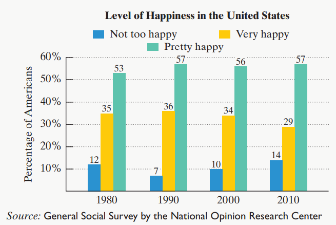
The set of years in which more than 55% were pretty happy or 12% were not too happy
Unfortunately, we don't have that question answered yet. But you can get it answered in just 5 hours by Logging in or Becoming a subscriber.
Becoming a subscriber
Or look for another answer